¶ Site background
A site can have one of the following background types:
- A single color
- A static image
- An iFrame (Another website as background)
All types will fill the background size, as defined here.
¶ A single color
For this type, a single background color can be provided (e.g. #FFFFFF for white). All areas that are visible, but not covered by elements, are colored according to this value.
¶ iFrame
Use an iFrame to display any given website as the background of the current page. This background-page has the full functionality as the original website, meaning that the user can navigate, click links, and see media on said website. This can be useful for:
- Designing a page with features that exceed those of this configuration builder
- Display media
- Allow for user interaction, e.g. for a webshop
To use this type, enter the full url (e.g. https://mybiozoom.com) in the input field.
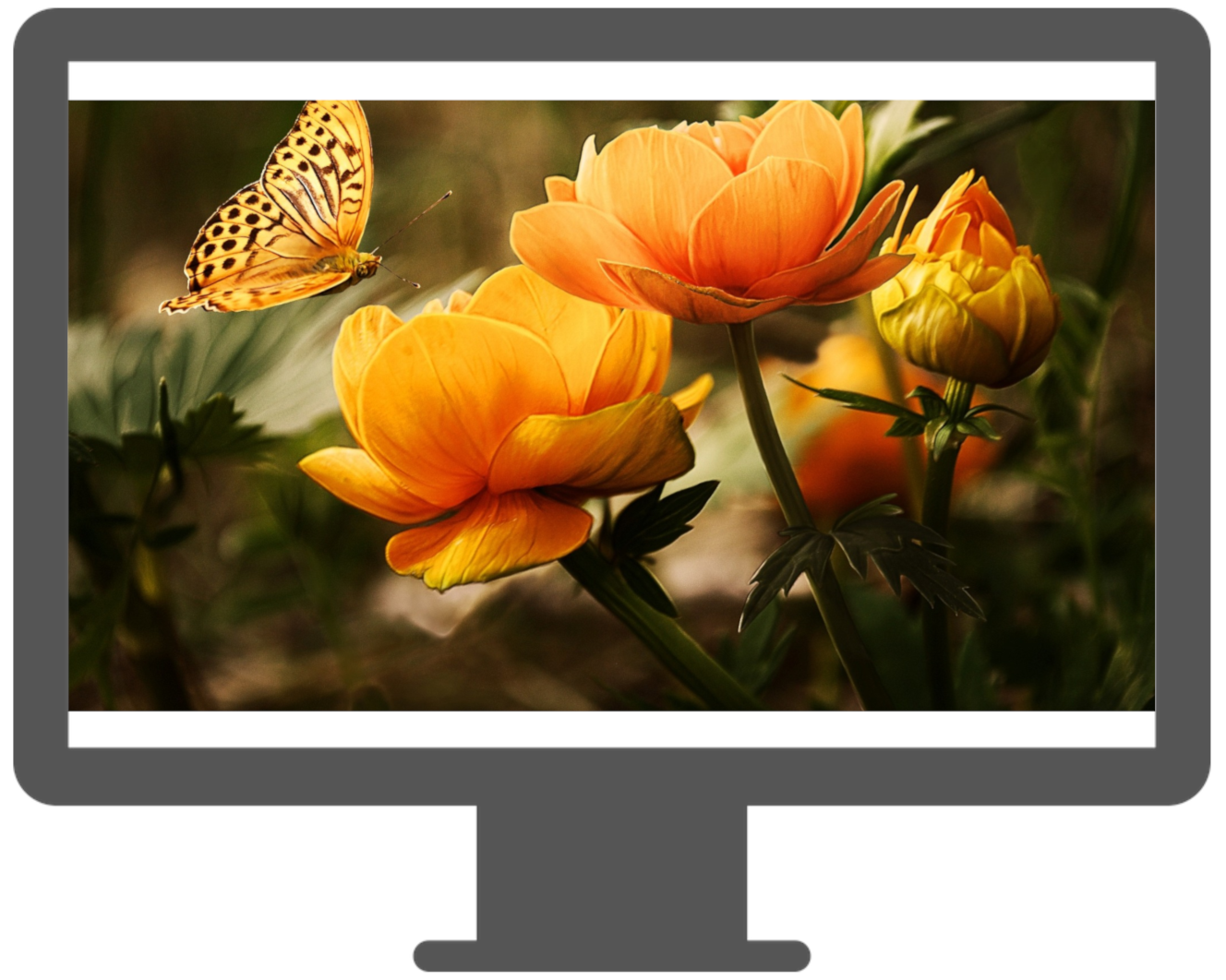
¶ Image
¶ Default mode
To use an image as the background, first upload it via the media manager, or to a website of your choice (also see here). Note that the internal upload tool provides a link without and prefix, just the image name (e.g. image_c0786a6081b6304c8c34b5cdc66919b7.jpg). Please enter this name as-is, the app will find the proper server to download it from.
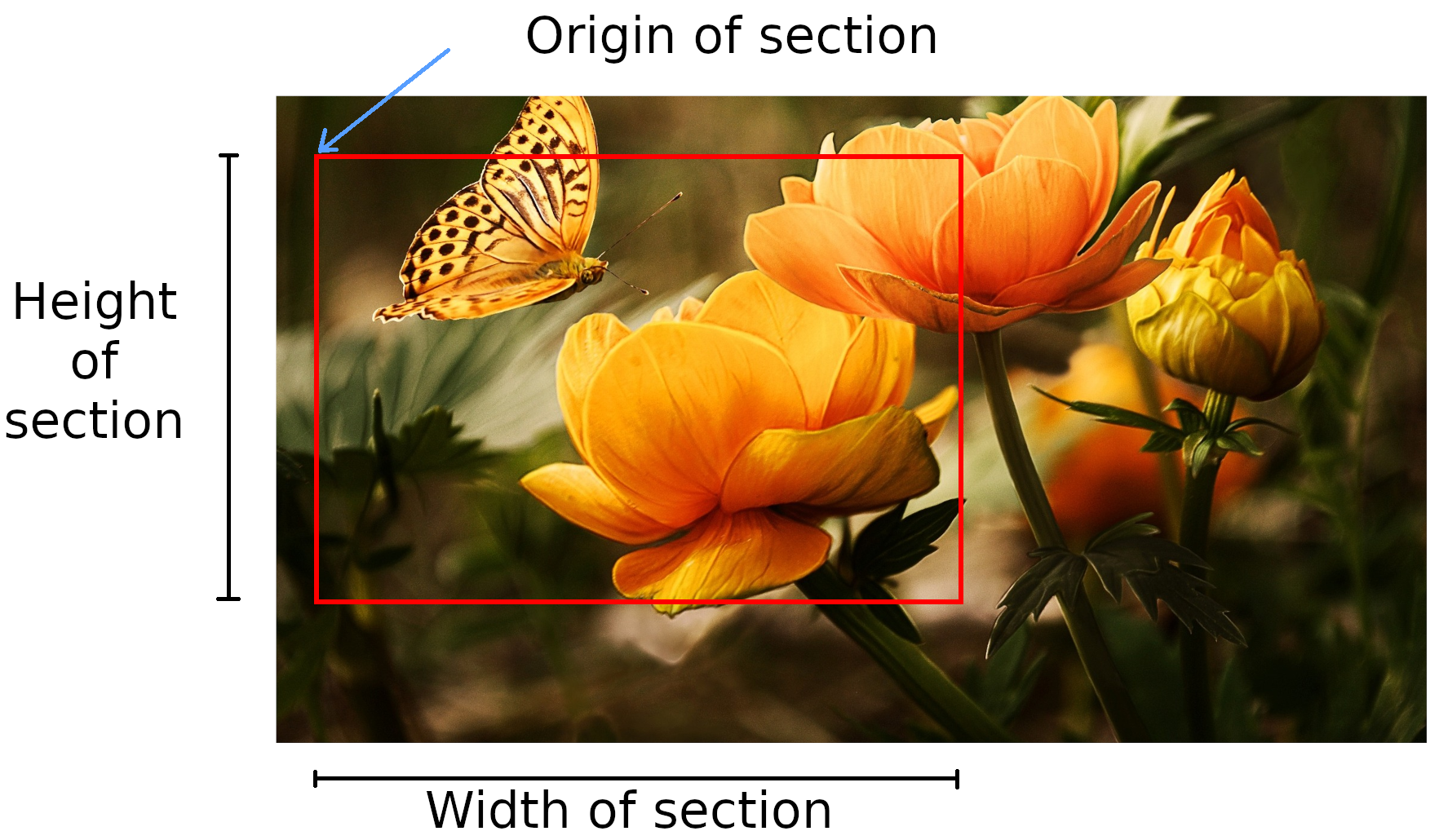
Measure the image in pixel, as shown in the following image, and enter the dimensions as background size here.
The app ensures that the entire image is visible. This means that the image will be scaled down to fit onto the screen in its entirety, leaving either bottom- and top, or left- and right empty.
These void areas' resolutions depend on the user's device, as well as the chosen image. The more the image's resolution ratio (width / height) exceeds the display's resolution ratio (or vice-versa), the wider these empty areas will appear.
¶ Border mode
In order to prevent this, a sub-section of the background can be chosen as the "this area should always be visible"-section.
This area will then behave just like the normal background did before - it will be scaled/shrunken down to just fit onto the screen, with the difference that the former void-areas are now filled with the continuous parts of the background image.
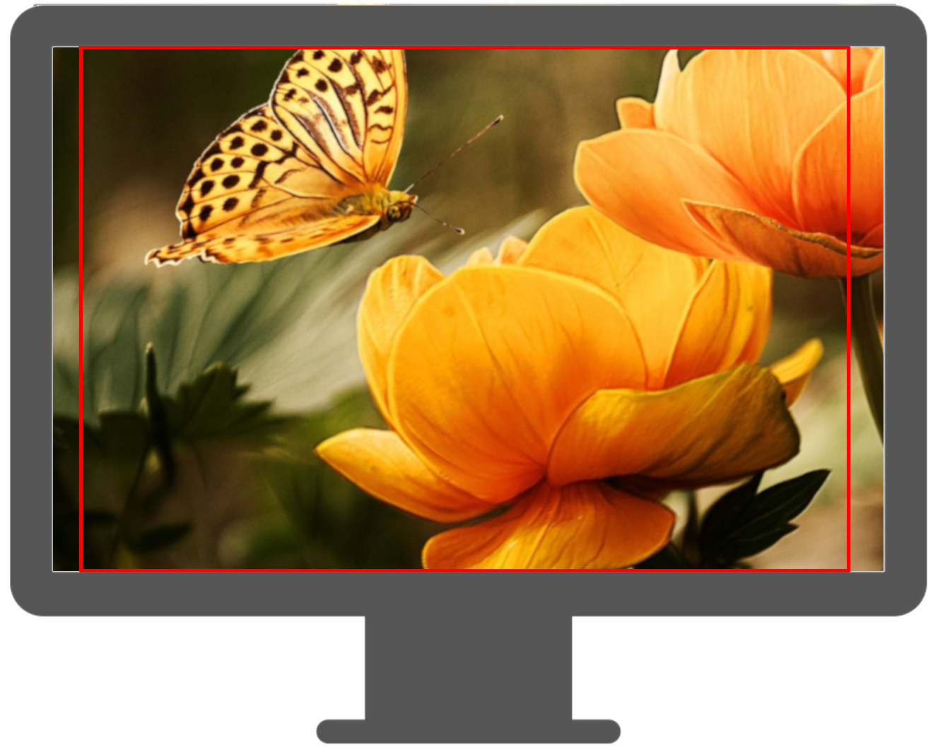
In essence, this means that a background can be designed to include a "must-see"-area, and a "border" around this main area. Depending on the device, a varying amount of border will be seen (including 'none', if the area's resolution ration equals that of the device).
¶ Background scaling mode
In addition to the mode described above, there are additional ways to fit the canvas (The canvas is either the background image, or, in case of the border-mode being used, the must-see area) on the screen. The initial method (that was used above) is to contain the canvas, meaning that it will always be fully visible, with two out of four borders aligned with the screen. The other options are
cover: Instead of the canvas being fully visible, it will be used to cover the entire screen without stretching. This results in not the canvas being visible, but only the center-portion. In general, this means that the other two borders of the canvas are aligned with the screen (compared to thecontain-mode).fit-width: A situational combination of the methodscoverandcontain. The canvas will always fit the screen perfectly in the horizontal dimension (meaning it will be exactly as wide as the screen), and the vertical dimension might be filled entirely by the canvas, or partially by the border, depending on the screen resolution.fit-height: The same as thefit-width-mode, except that the canvas will now be scaled to always match the display's vertical dimensions.stretch: The canvas can be used to fill the screen exactly in both dimensions by stretching it unproportionally.
¶ Example
For an square image with width and height of 1468px, the following config could be used

It would result in an area of size (500px * 500px), starting at the original image's coordinates (484px, 484px), resulting in the square being the exact center of the image
(1468px - 500px - 2*484px) = 0